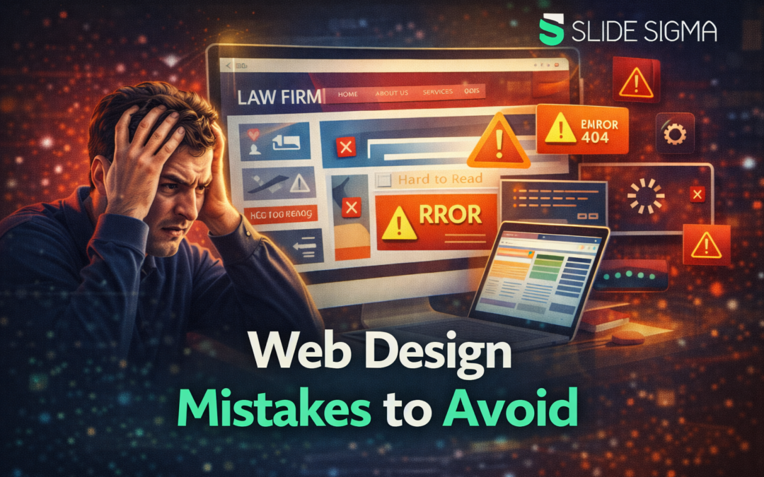
Web design mistakes can quietly damage your website’s performance, even when your content and intentions are strong. If users struggle to navigate, read, or trust your site, they leave before converting or engaging.
This guide explains the most critical web design mistakes to avoid so you can build a site that supports usability, search visibility, and long-term growth.
You will learn how design decisions affect real user behavior and how small errors compound into major performance problems. Each section focuses on practical improvements you can apply immediately to create a cleaner, more effective website experience.
Ignoring Mobile Users and Responsive Design
Ignoring mobile users is one of the most damaging web design mistakes to avoid because mobile traffic dominates modern browsing behavior. Studies show that over half of global web traffic comes from mobile devices, meaning a poor mobile experience directly limits reach and engagement. If your layout breaks, text becomes unreadable, or buttons are difficult to tap, users abandon your site almost instantly.
Responsive design ensures your website adapts smoothly across devices instead of shrinking desktop layouts onto smaller screens. You should prioritize flexible grids, scalable typography, and touch friendly navigation so content remains usable at every screen size. A well implemented responsive layout also improves SEO by meeting search engine expectations for mobile usability.
If you want deeper insight into why mobile design matters so much today, understanding what percentage of web traffic is mobile helps clarify why mobile optimization is no longer optional. When mobile experience improves, bounce rates drop and user satisfaction increases. This directly supports higher rankings and stronger conversion performance.
Poor Navigation and Confusing Site Structure
Poor navigation is a web design mistake that frustrates users before they even explore your content. If visitors cannot understand where to go within a few seconds, they lose confidence and exit the site. Clear structure helps users and search engines understand how your content fits together.
Your navigation should be simple, predictable, and focused on user intent rather than internal jargon. Menu labels must clearly describe destinations, while important pages should never be buried behind multiple layers. A clean hierarchy allows users to move through your site with minimal effort.
Good navigation also supports crawlability and internal linking, which helps search engines index your pages correctly. When users find what they need quickly, engagement metrics improve naturally. That positive behavior signals relevance and quality to search engines over time.
Using Images Instead of Real Text Content
Relying on images to display text is a common web design mistake to avoid for both accessibility and SEO reasons. Search engines cannot read text embedded inside images, which means valuable content becomes invisible to crawlers. Users with screen readers also struggle when text is not presented as real HTML.
Important headings, descriptions, and calls to action should always be written as selectable text. Images should support content visually rather than replace essential information. This approach improves readability, accessibility, and indexability simultaneously.
Image heavy designs also increase page load time when not optimized properly. Slow pages frustrate users and negatively affect rankings. By prioritizing text first and visuals second, your site remains fast, usable, and search friendly.
Overloading Pages With Too Many Design Elements
Cluttered pages overwhelm users and dilute your message, making this one of the most overlooked web design mistakes to avoid. When every element competes for attention, users cannot identify what matters most. Excessive fonts, colors, animations, and widgets reduce clarity rather than enhance creativity.
Whitespace plays a critical role in guiding user focus and improving comprehension. Strategic spacing helps important elements stand out while reducing cognitive load. Clean layouts make content easier to scan and understand.
Minimalist design does not mean boring design, but intentional design. Each element should serve a clear purpose aligned with user goals. When unnecessary elements are removed, usability and conversions improve naturally.
Weak or Unclear Calls to Action
Weak calls to action are web design mistakes that directly limit conversions. If users do not understand what to do next, they hesitate or leave. Effective CTAs guide users clearly toward actions that match their intent.
Your CTAs should use simple language that explains the benefit of clicking. Placement also matters, as important actions should appear where users naturally pause or complete reading. Visual contrast helps CTAs stand out without feeling aggressive.
CTAs work best when supported by surrounding context that builds trust. Clear value propositions and reassuring signals increase click through rates. When CTAs align with user expectations, conversions feel natural rather than forced.
Using Outdated or Unsupported Technologies
Using outdated technologies is a serious web design mistake to avoid because it harms compatibility and performance. Tools like Flash or unsupported frameworks often fail on modern browsers and mobile devices. This creates broken experiences that users cannot fix.
Modern websites rely on HTML, CSS, and JavaScript standards that evolve with browsers. These technologies support speed, accessibility, and cross device compatibility. Staying current also improves security and maintainability.
Search engines favor modern, fast loading websites that provide consistent experiences. When your site relies on outdated tools, rankings and usability suffer together. Updating your technology stack protects your site’s long term viability.
Poor Visual Hierarchy and Typography Choices
Lack of visual hierarchy confuses users and makes content harder to digest. When headings, body text, and supporting elements look similar, users struggle to scan information. This is a subtle but damaging web design mistake to avoid.
Typography should guide the reader naturally through the page. Clear heading sizes, readable fonts, and consistent spacing improve comprehension. Using too many fonts or decorative styles disrupts flow and reduces professionalism.
Good hierarchy improves accessibility and engagement. Users spend more time on pages that feel easy to read. That positive behavior supports stronger SEO signals and better overall performance.
Ignoring Accessibility Best Practices
Ignoring accessibility is one of the most harmful web design mistakes to avoid because it excludes users and limits reach. Accessibility improvements help users with visual, motor, and cognitive challenges navigate your site effectively. Inclusive design benefits everyone, not just users with disabilities.
Key practices include proper contrast, readable font sizes, descriptive alt text, and keyboard friendly navigation. These elements improve usability across devices and environments. Accessibility also aligns with legal and ethical responsibilities.
Search engines reward accessible sites because they are easier to crawl and understand. When accessibility improves, so does user trust and engagement. Inclusive design is a competitive advantage rather than a limitation.
Bad URLs, File Naming, and SEO Structure
Poor URL structure is a technical web design mistake that quietly damages SEO. Confusing, long, or auto generated URLs reduce click trust and readability. Clean URLs help users understand page purpose before clicking.
File naming also matters for images, documents, and scripts. Descriptive names improve organization and search visibility. Hyphens should be used instead of spaces to avoid technical issues.
When optimizing internal links, you should avoid aggressive patterns that harm rankings. Understanding what anchor text over-optimization is and how you can fix it helps you build natural linking structures that support SEO. Balanced internal linking improves discoverability without triggering penalties.
Failing to Build Trust Through Design
Trust is built visually before users read a single word, making poor credibility signals a major web design mistake to avoid. Missing contact information, inconsistent branding, or intrusive popups reduce confidence instantly. Users expect professionalism and transparency from modern websites.
Security indicators such as HTTPS, clear privacy information, and professional layouts reassure visitors. Testimonials, clear about pages, and consistent branding reinforce legitimacy. These elements work together to establish authority.
Trust directly influences conversions and engagement. When users feel safe, they interact more freely with content and forms. Strong trust signals support long term growth and brand loyalty.
Neglecting Performance and Load Speed
Slow websites frustrate users and harm rankings, making performance neglect a critical web design mistake to avoid. Research shows that even a one second delay can reduce conversions significantly. Users expect fast, smooth experiences across devices.
Performance optimization includes image compression, efficient code, and reliable hosting. Lazy loading and caching further improve load times. These improvements benefit both users and search engines.
Fast websites feel more professional and trustworthy. When pages load quickly, users stay longer and explore more content. Speed improvements often produce immediate results in engagement metrics.
Overlooking E-Commerce and Conversion Design Needs
Ignoring conversion focused design is a costly web design mistake for business driven sites. E-commerce pages require clarity, trust, and usability to guide purchases. Poor layouts and confusing checkout flows increase cart abandonment.
Responsive layouts are especially important for online stores. Learning about responsive ecommerce web design and why it is important helps ensure product pages and checkout flows perform well on all devices. Mobile shoppers expect frictionless experiences.
Conversion optimization is not about pressure, but guidance. Clear product information, simple navigation, and visible support build confidence. Well designed conversion paths improve revenue without aggressive tactics.
Conclusion
Avoiding common web design mistakes helps you create a website that supports users, search engines, and business goals at the same time. Each design choice influences how users perceive, trust, and interact with your site. Small improvements in structure, clarity, and accessibility produce measurable results over time.
When you focus on usability, performance, and clarity, your website becomes easier to maintain and scale. Thoughtful design reduces friction and increases engagement naturally. By applying these principles consistently, you build a site that performs well today and adapts smoothly to future demands.